1/23/2005 07:30:00 PM - Pref Window of Doom
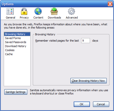
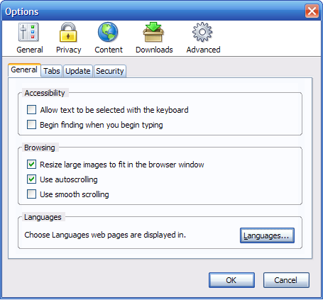
Ben recently posted screenshots of the prefs window he's working on. I'm appalled. The navigation is all over the place. The main buttons are on the top. One subscreen has tabs. One subscreen has navigation links on the left. Some items are broken out into separate sub-subscreens, and some have them all in one place.
Yes, i don't like it either. Somehow, it reminds me of IE's settings.
Why change a very nice layout? The new features are nice, but not the look of it.
VStrider.
Why change a very nice layout? The new features are nice, but not the look of it.
VStrider.

In screen shots it looks bad, but once you use it you will see it is in fact superior. If you've been on a Mac recently, you will have experienced this kind of Prefs, and just how wonderful and intuitive they really are.
Try not criticizing it until you actually have played with it first.
Try not criticizing it until you actually have played with it first.

I don't know. I think they're a bit more intuitive to follow. Essentially, he made them look just like an Apple preferences panel. They're easy enough to figure out. I think the biggest thing is to make the UI as easy to understand as possible for the average end user. In this regard, even IE's prefs are hard to follow.
Nah I agree, it's too complex. Accept that the preferences naturally fit a tree structure, stick a tree in the LHS panel and be done with it.
There were comments on a previous blog that new users didn't realise they could get more options by choosing the items on the left hence moving them to the top which I guess makes sense.
Some of the new problems are - the Advanced dialog - many of these options aren't any more advanced than the other dialogs and confusingly have a tab system...
"Sanitize" is just such a horrible word and is probably not a word many non-English native speakers will be familiar with. I'm not sure what's wrong with variants of clear/privacy - the icon is also wrong as a padlock points towards security (which is stuck on a tab under advanced) and not privacy.
There's also some mix of title case and correct English case on the dialogs and many other minor oddities.
Hopefully all these issues will be resolved before 1.1 hits the streets. Perhaps Ben could release some sort of test version before then.
[)
Post a Comment
Some of the new problems are - the Advanced dialog - many of these options aren't any more advanced than the other dialogs and confusingly have a tab system...
"Sanitize" is just such a horrible word and is probably not a word many non-English native speakers will be familiar with. I'm not sure what's wrong with variants of clear/privacy - the icon is also wrong as a padlock points towards security (which is stuck on a tab under advanced) and not privacy.
There's also some mix of title case and correct English case on the dialogs and many other minor oddities.
Hopefully all these issues will be resolved before 1.1 hits the streets. Perhaps Ben could release some sort of test version before then.
[)
